1. I have little to no experience with video editing at all.
2. On your phone you have access to the internet and storage, so you can edit, retake, save, and mess with videos easily. On a go pro or DSLR, you have your camera which gets the footage, then you need to edit the footage separably on a computer later.
3. I'm probably going to do something with my dog, video games, or my grandparents.
4. I can show a still image while talking instead of videoing myself talking while doing something.
5. Mostly background music.
Friday, May 22, 2020
Sunday, May 17, 2020
Point of View
1. Bird's eye, Becoming the Subject, Eye Level, Worm's Eye View
2. Bird's eye: Shooting from above looking down
Becoming the subject: Intersecting with the subject who you are shooting (with a camera).
Eye Level: Most common approach. Shooting on a level plane with the subject.
Worm's Eye View. Shooting from below looking up.
3. Choose a Focal Point, Balance the grander and lesser elements of the shot
4. Cardboard Shavings, Crushed Bottle Cap
5. Maybe somewhere between 4/5-8 ish.
5. I might do my Nintendo switch items, my bathroom items, and my school books/papers.
6. I'm worried about texture and where to put stuff cause I don't want to dirty any part of my house, nor do I want stuff all over my items. I also am worried about where I will put them, cause, for example, if I use the floor for texture but then put my toothbrush there, that's going to be gross.


Sunday, May 10, 2020
Sunday, May 3, 2020
Free Review Preview
Childish Gambino returns with mysterious album “3.15.20”
1. They reviewed Donald Glover's (aka Childish Gambino) latest album that not only is titled after the day it was released, 3/15/20, but contains mostly songs tilted in the same manner.
2. They explained how this album was a step out of his comport zone as he tried new styles for his songs which both positively and negatively impacted his album. However, these experiments where primarily detrimental. This album was also supposed to be his last one before he retired.
3. They first just said that he released it before describing the mystery of the date-based naming of the songs and album.
4. They give no numerical rating, but they do describe the piece as having a few amazing moments, but being mostly a poorly developed experimental music collection.
5. Yes
6. They did describe some of the songs, but I don't fully know what they will sound like, just what type of music they are and whether they might be good.
7. I think the article does a good job at reviewing the album, but personally, I don't understand the music portion too much, so I wish they used a bit simpler terms when describing the music. However, that's just me, and people who actually care about the album and the music artist understand better.
Tara Westover’s ‘Educated’ redefines what an education is
1. They reviewed Tara Westover's novel "Educated", which is a 3 part story about her abnormal education with her family and her formal education into college.
2. The book is about her struggle growing up between her formal education and her family's way of life. It's a journey where she learns the definition of education through her rough life at home.
3. They start by explaining how Westover's book tries to find the meaning of education, then they begin explaining what her abnormal life growing up was like without too much detail.
4. They gave no numerical rating, but they are quite enthusiastic about how deep and captivating the story is while also exploring a unique definition to education and what it truly is.
5. Yes
6. They did explain some plot points such as some of her family members, but they don't spoil any events or any part of the plot as far as I can tell.
7. I really liked the review because I could sense the deep emotion it conveyed. I really felt interested in the book and understood how intense it was without reading it.
Saturday, April 25, 2020
Friday, April 17, 2020
Movie Review Prep
Star Wars Nine: Rise of Skywalker
1. JJ Abrams
2. Lucasfilm, Bad Robot Productions
3. no
4. The movie is set in a galaxy far far away. Filmed at Pinewood Studios in Buckinghamshire, England and Wadi Rum, Jordan.
5. PG-13
1. JJ Abrams
2. Lucasfilm, Bad Robot Productions
3. no
4. The movie is set in a galaxy far far away. Filmed at Pinewood Studios in Buckinghamshire, England and Wadi Rum, Jordan.
5. PG-13
6. J.J. Abrams, Michelle Rejwan, Kathleen Kennedy
7. Film Score of the Year John Williams, Best Original Score for a Fantasy/Science Fiction/Horror Film John Williams, Film Music Composition of the Year John Williams for the composition track "The Rise of Skywalker", IFMCA Award
8. 275 Million US Dollars
On rotten Tomatoes:
9. Audience: 86%, 4.31 average rating, 98k + ratings
10. Critics: 52%, 6.15/10 average rating, 483 ratings, site considers the movie "rotten"
11. Sheev Palpatine, played by Ian McDiarmid
Kylo Ren, played by Adam Driver
Rey, played by Daily Ridley
Poe Dameron, played by Oscar Isaac
Finn, played by John Boyega
Movie Review Preview
Sonic the Hedgehog review: Hyper hero escapes the curse of Cats in big screen debut
1. London Inside
2. Charlotte O'Sullivan
3. 7/10
4. Jim Carrey played Dr. Robotnic, neat car chase, quality special effects. isn't a terrible videogame based movie
5. Sonic's original design, "There are plenty of unoriginal/moronic/mundane moments in Sonic"
6. "Let’s be clear. There are plenty of unoriginal/moronic/mundane moments in Sonic and when Carrey yells “give me a big fat break” he’s probably thinking, “give me a big fat cheque”. Still, he pumps so much electricity into the proceedings that you don’t feel cheated. The world contains many terrible video game movies. This isn’t one of them."
Should I See It Sonic The Hedgehog (2020)
1. Should I See It
2. Mike Ward
3. 9/10
4. Jim Carrey played Dr. Robotnic, movie has a quick pace (fits with sonic being sonic), sonic is innocent and friendly (good for the kids), helps balance wild Jim Carrey
5. The original sonic design,
6. "Kids and younger viewers are going to have a ball however with the vivid colors, action sequences, and silly humor. Carrey will appeal to them as he eats all the scenery, consumes all the air, and leaves little for anyone else to do when he’s on screen. In the title role, Ben Schwartz provides the voice and facial motion capture for Sonic, whose kind, largely innocent demeanor serves both as a counterbalance to Mr. Robotnik’s wild shenanigans, but also gives viewers a pure and emotional core to invest in."
Monday, April 6, 2020
Wednesday, March 11, 2020

Tuesday, March 10, 2020
Car Raid Preview
1. My neighbor across the street: A A Ron
2. I will probably do this either the Wednesday or Thursday before spring break.
3. What car do you have? (Model, year, type, etc.)
Where/Why did you get this car?
Where/How often do you drive this car?
What do you have in your car?
What do you like most about your car?
Have you worked on your car or had it worked on? (If yes) What and Why?
4. I want to write down single word phrases that are significant to connecting my subject to his car, such as a word describing his feelings for it, or a word for how he's worked on it, or a word for where he goes with it. Things like that.
Friday, March 6, 2020

Wednesday, March 4, 2020
Motion Photo Prompts
Photo 1: Subject moving towards the camera

Photo 2: Subject moving across the plane of the camera

Photo 3: Panning

Photo(s) 4: Blur


Photo 2: Subject moving across the plane of the camera

Photo 3: Panning

Photo(s) 4: Blur


Monday, March 2, 2020
Sunday, March 1, 2020
Dispatch Issue #4
News: New internet filter identifies students in need of support
AISD Chromebooks are monitored and filtered, and AI has been used to determine whether a potentially alarming search is for school or needs attention. If a search is considered alarming, it's sent to the student's councilor and their parents, and the student is called to see the councilor to verify if the search is a concern or not.
1. Kevin Schwartz, Tracy Spinner, Nicole Hepburn, Nicolas Batos
2. "We're a team, much like a sports team... before they escalate their behaviors to harm themselves or someone else."
3. I was drawn in by in the lead because it addition of a political element interested me. However, I feel like the lead isn't really a lead due to it's length.
4. Quote
Commentary: Businesses support any political charity of their choice
Many companies will donate to charities, but some specifically avoid donating to to certain charities will separate morals, such as Chick-fal-A not supporting LGBTQ. It's the consumers' choice to support those companies' decisions because no matter what companies decide do donate for, it's the consumers who provide the money to do so through their services.
1. Dan Cathy, Chick-fil-A Foundation
2. "We are very much supportive of the family-the biblical definition of the family unit."
3. I don't feel that the lead sentence, or the paragraph, made me want to keep reading. It seemed pretty simple and not attractive. In fact, I found the entire rest of the story more interesting.
4. Statement
Feature: The rising "flex" culture changes customers purchases
"Flex culture" is a culture becoming popular amongst teenagers and/or high schoolers where it's normal/popular to purchase expensive, new items. This culture views purchasing expensive material goods as a rewarding, luxurious achievement, as it teaches people how to save up for something they really want.
1. Ethan Ramirez, Riley Hughes, Vincent Nguyen, Jaqueline Gonzales
2. "I feel good when I make one of these purchases, but a little unsettling, since it's so expensive... and 'flex it to your peers." (I just skipped writing most of the quote to save time)
3. I don't really feel attracted by the lead sentence. It's only somewhat that attractive in it's language. It's simple and straight to the point, but it seems like a pretty obvious statement, and it doesn't give much to attract me to the story.
4. Quote
(This one was filled with a lot of many grammatical errors, enough to make the story feel choppy)
Sports: Student gamers impress at eSports competition
Bowie's eSports team is becoming popular, and it's performing well in competitions. They have already attended a competition against another AISD high school, and they destroyed them in games such as Rocket League and League of Legends.
1. John Demopoulos, Principal Mark Robinson, Jack Vinson
2. "For the first time, indead of sports teams... in eSports, it's a big opportunity,"
3. I don't think the lead sentence was attractive at all. The first sentence felt like a short 3rd grade sentence that conveys zero emotion when you read it; in other words, it was simple, lacking, and outright bland. The lead also seemed to be that sentence, but it was inside a transition. (I feel like this is overly critical)
4. Quote
In-Depth: Global human rights violations and social issues lead student activists to take action by advocating on a personal level
Young people these days don't feel that they understand social, political, or human rights problems enough to voice an opinion on that and instead prefer to focus on their own lives and "now". However, it's up to young people to voice their opinion as the generation emerging into power so they change take action when they finally become old enough to make a change.
1. Jake Stachura, Malaika Beg, Kam Magor, Rachel Cambers
2. "It's an anger towards unjust actions... you've changed the world."
3. I feel the lead was quite attractive. It is simple, but it gives enough information to be interesting and make me wonder what else there is. I don't think just the lead sentence is enough on it's own to draw me in, but combined with the rest of the lead, it's simple, informative, and attractive.
4. Quote
Third:
1. I like the photo on the middle-left of page 11. I mainly just like the lighting and the environment. It reminds me of watching a sunrise or sunset and just enjoying it.
2. I dislike the photo to the top-right of page 12. It's somewhat creepy because it seems like someone tore up sheets and cotton plants and hung the shreds over their self. I also generally don't like pictures of people.
3. I really wish I had taken been involved in the e-sports story.
4. I feel like the photos where just fine. There were a lot of different ones, which was great, but I don't personally like a lot of photos of people. That may just be normal, but I personally don't like it.
Fourth:
1. I like the graphic in the middle of page 14 about social media. It doesn't show any emotional expressions, but the black color of the person and their body posture really gives a feeling of being drained. I do think the arm's position could have been a little different 'cause it looks like it's coming out of the guy's side, but that's just me being picky. Overall, I really think it conveys it's message very well. I don't even need to read the title or the article to understand what the article is about.
2. I dislike the other graphic on page 14 at the top with the brown background. I feel that it conveys its message with a little too much text and not enough imagery, and it feel somewhat lacking in content. While the figure in my first picture helped by conveying a lot of emotion with just it's position, the person in this graphic is nearly emotionless, and that's really what does it for me.
3. First, that person needs some sort of emotion. They have two eyes and an open mouth. Just adding pupils or eyebrows could do a lot for it. Also, it's pretty lacking in content. I feel like adding a little more detail to the phone would make it a lot more visually pleasing.
4. I have a mixed opinion about the issue's graphics. The small, single picture ones were good at being simple and visualizing their article's point, but some of them were a little to simple to the point where they felt lacking. I wanted more from some of those. Also, out of the 2 larger graphics one was better than the other. I liked the one of the guy on the sofa and how much detail, was in that one, but the giant fist just got in the way of part of the article's text and made it hard to read.
Monday, February 24, 2020
Sports Current Event
1. Link
2. How the Kansas City Chiefs Beat the 49ers to Win the Super Bowl
3. The Chiefs were loosing to the 49ers, but Patrick Mahomes leads the Chiefs to a comeback victory int he 4th quarter.
4. fourth quarter, completion, wide receivers, postseason, turnover
5. raucous, crucial, ebullient, gutting
6. I think this article is mostly a recap, or at least the beginning portion. The first section is just a quick recap about the Chiefs beating the 49ers, but the rest of the REALLY long article is a bunch of published updates. It was a list of posts about the Super Bowl as it progressed. It covered a lot, and I don't know how to categorize that, since it's more of a bunch of updates rather than an article. However, the first part is definitely a recap because it doesn't go deep into explaining how the Patrick Mahomes helped lead the Chiefs to victory, it just acts as an overview.
7. "After a 50-year wait, the Kansas City Chiefs are Super Bowl champions once again, after Patrick Mahomes engineered a stirring fourth-quarter comeback Sunday to beat the San Francisco 49ers, 31-20, at a raucous Hard Rock Stadium."
Sports Exploration Activity
1. Football
2.
3. 1. Kansas City Chiefs 2. San Fransisco 49ers 3. Baltimore Ravens 4. New Orleans Saints 5. Green Bay Packers
4. 1. 10 Loses, 12 winds 2. They made it into the playoffs (2019-2020) 3. The Kansas City Chiefs won the Super Bowl (2019-2020)
5. 1. You can kick the ball for a field goal for 3 points on 4th down. 2. No tackling someone without the ball 3. No grabbing other players face masks
6. 1. The wall: players trying to block offensive players from reaching the goal 2. backheel: kick the ball behind you 3. possession: keeping the ball in the hands of your team
7. What this game needs is a goal: it means that it's been a long time without people scoring, and someone needs to score soon
8. Tom Brady was born August 3, 1977. He went to the University of Michigan and played for them before joining the New England Patriots. He holds the records for career Super Bowl Attempts (392), completions (256), yards (2,838), touchdown passes (18), and MVP awards (4).
Friday, February 21, 2020

Wednesday, February 19, 2020

Monday, February 10, 2020


Portrait
Far Zoom

Close Zoom

Medium Zoom

Again, I don't know which one would be best for a magazine.
Self-Portrait


Extra Image
I added 2 portraits as well as the extra because I didn't know which one was better.
Friday, February 7, 2020
Wednesday, February 5, 2020


Monday, February 3, 2020
Sunday, February 2, 2020
Magazines Part 2
Image based magazine covers are the most commonly used type of cover. They tend to have a person or a few looking at the camera and smiling, but they may have people positioned differently or the image is at a different angle. Image based covers may also be of a location or a landscape, but pretty much image based are just photography. Illustration based magazine covers are one's that are drawn or by an artists, whether on paper or pc, instead of a photograph. Most of these types are amusing or not ordinary because they aren't very common. Type based covers are usually eye catching or surprising. These covers tend to display what their contents are using a lot of words instead of a large image. Concept based magazine covers mix the first 3 elements to create a cover that maybe shocking and intense or humorous. Their goal is to create a story or convey an emotion instantly.
The photos and words on a magazine cover have to work together to give a magazine's first impression. The words have to display the information and present the contents briefly and effectively while the picture creates a feeling and/or act as a visual for the text that comes with it. Without words, people would just see an image and not know what to expect from the magazine. Without a picture, people just see a bunch of words on some paper and aren't interested. The combination of and relationship between the informational text and the visually impactive image create an effective, attractive, and informative magazine cover.
The photos and words on a magazine cover have to work together to give a magazine's first impression. The words have to display the information and present the contents briefly and effectively while the picture creates a feeling and/or act as a visual for the text that comes with it. Without words, people would just see an image and not know what to expect from the magazine. Without a picture, people just see a bunch of words on some paper and aren't interested. The combination of and relationship between the informational text and the visually impactive image create an effective, attractive, and informative magazine cover.
Favorite Portrait
3. Use one-point perspective This New York Times Magazine cover features James Gandolfini’s beat-up Cadillac convertible to represent the theme ‘The Lives They Lived (And The Things They Loved).’ The angle, placement and size of the car and the subtitle create a one-point perspective that vanishes into the distance.
I primarily like this portrait the best because it's simple but displays a powerful message. I also like that it's a portrait without any people in it. I some reason tend not to like most portrait's of people for some reason. The portrait itself uses a sort of worn metallic looking car combined with a blank white background to create a sort of empty feeling inside the magazine viewers. The small text in the center and what it says creates the idea of someone who's passed which emphasizes the image's tone of emptiness and silence. This portrait uses these feelings to prepare people for content inside the magazine talking about deiced people.
I primarily like this portrait the best because it's simple but displays a powerful message. I also like that it's a portrait without any people in it. I some reason tend not to like most portrait's of people for some reason. The portrait itself uses a sort of worn metallic looking car combined with a blank white background to create a sort of empty feeling inside the magazine viewers. The small text in the center and what it says creates the idea of someone who's passed which emphasizes the image's tone of emptiness and silence. This portrait uses these feelings to prepare people for content inside the magazine talking about deiced people.
Best Covers
1. Formal
2. Informal
3. Informal (Favorite)
6. Formal
7. Informal
8. Informal
9. Formal
13. Formal
15. Informal
16. Environmental
17. Formal
18. Formal
24. Formal
25. Informal
26. Formal
27. Environmental
29. Formal
30. Environmental
31. Formal
32. Informal
33. Informal
34. Formal
35. Environmental
36. Informal
37. Formal
38. Formal
39. Formal
40. Informal
41. Environmental
42. Environmental
43. Informal
44. Formal
46. Formal
48. Formal
49. Environmental
Wednesday, January 29, 2020
Magazine Tips
1. The image should allow the magazine to be identifiable throughout different issues.
2. It should have an irresistible pull factor that makes people want to look at it and see what's inside.
3. It should spark curiosity and draw interest from people just glancing at it.
4. It should be able to make people interested in what the magazine offer's or what's inside it.
5. It should stays simple and easy to look at quickly while being effective in what it advertises.
Three Pillars of Photography
(Note: I thought I had turned it in, but I guess I didn't when you caught me up on photoshop.)
Aperture:

f2.8

f16
1. The eye/pupil.
2. The smaller the aperture, the less light exposed and the more detail in the background/foreground. The larger the aperture, the more light exposed and the less detail in the background/foreground.
3. Larger apertures cause a greater reduction in Depth of Field in a photograph causing background and foreground blur. Smaller apertures cause a greater increase in Depth of Field in a photograph causing background and foreground sharpness and clarity.
Shutter Speed:

High shutter speed

Low shutter speed
1. fast, medium, long
a. medium
b. medium
c. medium (for a picture of the performance), fast (for a picture of an individual performer)
d. medium
e. long
f. fast
1.1.
a. long
b. long/medium (depending on distance/traffic of people)
c. medium (assuming the inside has the same light as the outside)
d. medium/long (depending on distance)
e. long
f. medium
2. Shutter Priority: You manually adjust shutter and the
ISO:

ISO 200

ISO 6400
1. At a sporting event, there are is a lot of constant motion, and using high ISO will allow images to be sharp, even if they aren't the highest resolution.
2. It's good to use a low ISO when trying to get the highest quality image with the least "noise" as possible if there is enough light to do it.
3. It's good to use high ISO when trying to get an image at a high shutter speed that will be blurry otherwise, but there isn't enough natural light to take a bright enough picture without it being blurry.
Aperture: 2.8, 3.5, 4, 4.5, 5.6, 6.7 8, 9.5, 11, 13, 16, 19, 22
Shutter Speed: 1, 1/2, 1/3, 1/4, 1/6, 1/8, 1/10, 1/15, 1/20, 1/30, 1/45, 1/60, 1/90, 1/125, 1/180, 1/250, 1/350, 1/500, 1/750, 1/1000, 1/1500, 1/2000, 1/3000, 1/4000
ISO: 100, 200, 400, 800, 1600, 3200, 6400
Aperture:
f2.8
f16
1. The eye/pupil.
2. The smaller the aperture, the less light exposed and the more detail in the background/foreground. The larger the aperture, the more light exposed and the less detail in the background/foreground.
3. Larger apertures cause a greater reduction in Depth of Field in a photograph causing background and foreground blur. Smaller apertures cause a greater increase in Depth of Field in a photograph causing background and foreground sharpness and clarity.
Shutter Speed:
High shutter speed
Low shutter speed
1. fast, medium, long
a. medium
b. medium
c. medium (for a picture of the performance), fast (for a picture of an individual performer)
d. medium
e. long
f. fast
1.1.
a. long
b. long/medium (depending on distance/traffic of people)
c. medium (assuming the inside has the same light as the outside)
d. medium/long (depending on distance)
e. long
f. medium
2. Shutter Priority: You manually adjust shutter and the
ISO:
ISO 200
ISO 6400
1. At a sporting event, there are is a lot of constant motion, and using high ISO will allow images to be sharp, even if they aren't the highest resolution.
2. It's good to use a low ISO when trying to get the highest quality image with the least "noise" as possible if there is enough light to do it.
3. It's good to use high ISO when trying to get an image at a high shutter speed that will be blurry otherwise, but there isn't enough natural light to take a bright enough picture without it being blurry.
Aperture: 2.8, 3.5, 4, 4.5, 5.6, 6.7 8, 9.5, 11, 13, 16, 19, 22
Shutter Speed: 1, 1/2, 1/3, 1/4, 1/6, 1/8, 1/10, 1/15, 1/20, 1/30, 1/45, 1/60, 1/90, 1/125, 1/180, 1/250, 1/350, 1/500, 1/750, 1/1000, 1/1500, 1/2000, 1/3000, 1/4000
ISO: 100, 200, 400, 800, 1600, 3200, 6400
Monday, January 27, 2020
Portraits
Alter your Perspective


Introduce a Prop
Hold your camera on an angle
Environmental
I really like the sunset-like lighting, and the logs in the background are oddly satisfying.
I find something about this guy holding knives ready to do business somewhat pleasing. It gives me the feeling that he's about to work hard and well, like a montage.
Self Portrait
The effect with all the mirrors is cool, and it helps the picture feel much less gloomy than most of the others I saw.
This image is permanently engraved into my mind. I cannot unsee it. That is not natural at all.
Casual Portrait
I like the simplicity of the background and how it isn't a self portrait that's black and white and gloomy.
I like how much nature he got in the background and how it isn't a self portrait that's black and white and gloomy.
I don't have a plan yet, but I really wish I could do my grandpa. He is about to go through chemotherapy, and I want to take a picture of him this weekend just to show how strong he has been through all of this, but I'm not getting a camera until the day after I come back, and I may not visit him again for a while. I have no executable plan.


Monday, January 13, 2020
Photo Manipulation and Ethics
A. People who manipulate images need to create the best image they can without being unethical.
People often manipulate a photo to the point where it is unethical or displaying some sort of falsity from the original picture.
Manipulating images has become so easy nowadays. It used to take hours, but now it just takes the knowledge of editing software.
Photographs often get edited to the point where they aren't accurate and show more of a lie than an actual image.
It's getting much harder to figure out what in pictures is authentic vs edited.
Those who edit pictures often neglect ethnics of photo editing because their job is to make a picture that grabs people's attention and draws them in to maybe read a news article or buy a certain product.
The boundary for which a photo goes from ethical to unethical varies. One person may think a picture is ethical while someone else may disagree.
Media editors have to balance creating the most appealing picture with keeping the picture ethical.
Some solutions are media editors increasing the number of photographers they know so they can get the best picture and have to do the least possible editing, creating a set of ethnical boundaries and sharing it with people so that others can input their opinion if they think it's unethical, or just creating a universal set of ethnic rules for all media.
B. These newspapers have very strict guidelines for ethnicity. They want to keep image manipulation to a minimum to preserve as much authenticity of images as they can. Photographs, to them, are the visuals for events. Even with the words of articles and stories, newspapers use images as authentic visualization for the readers and even the writers.
C. I feel that some editing is ok, and maybe even necessary. Cropping, for example, should be used to remove distracting or unimportant aspects from a picture without erasing important details or major parts of it. Blurring can be used to fade out the unimportant to make readers focus on what the newspaper wants to be focused on without obstructing possibly significant sections. Changing color or color tone may be useful for making an image easier to look at or highlight what's important, but it shouldn't be drastic enough to do something such as change the skin tone of someone's picture or modify the setting of the picture. Cropping and adding to a picture might be necessary, but almost should never be used. It's basically adding elements to a photograph to create a false scene. However, I do feel it has some use, I just am not sure what.
D.
I feel this picture is the most unethical: an attempt to expose a Republican politician by creating a somewhat inappropriate image that negatively emphasized the Conservative view of gun rights. Not only did this picture place someone's face on a body that was not their own, but it was a completely false picture that attempted to give someone a bad political reputation.
E.
I feel that this picture is the lease unethical. It didn't do anything to alter the visual appearance of a person or create a misleading scene, it just needed to fit the magazine and be presentable. Though the image is distorted, changing the size of a dim picture of only part of 2 pyramids doesn't seem like a very big deal.
Wednesday, January 8, 2020
2019 Reflection

I like how vivid and shiny the color is, and the blur of people at the bottom combined with the multiple pillars creates a satisfying vertical flow in the photo.
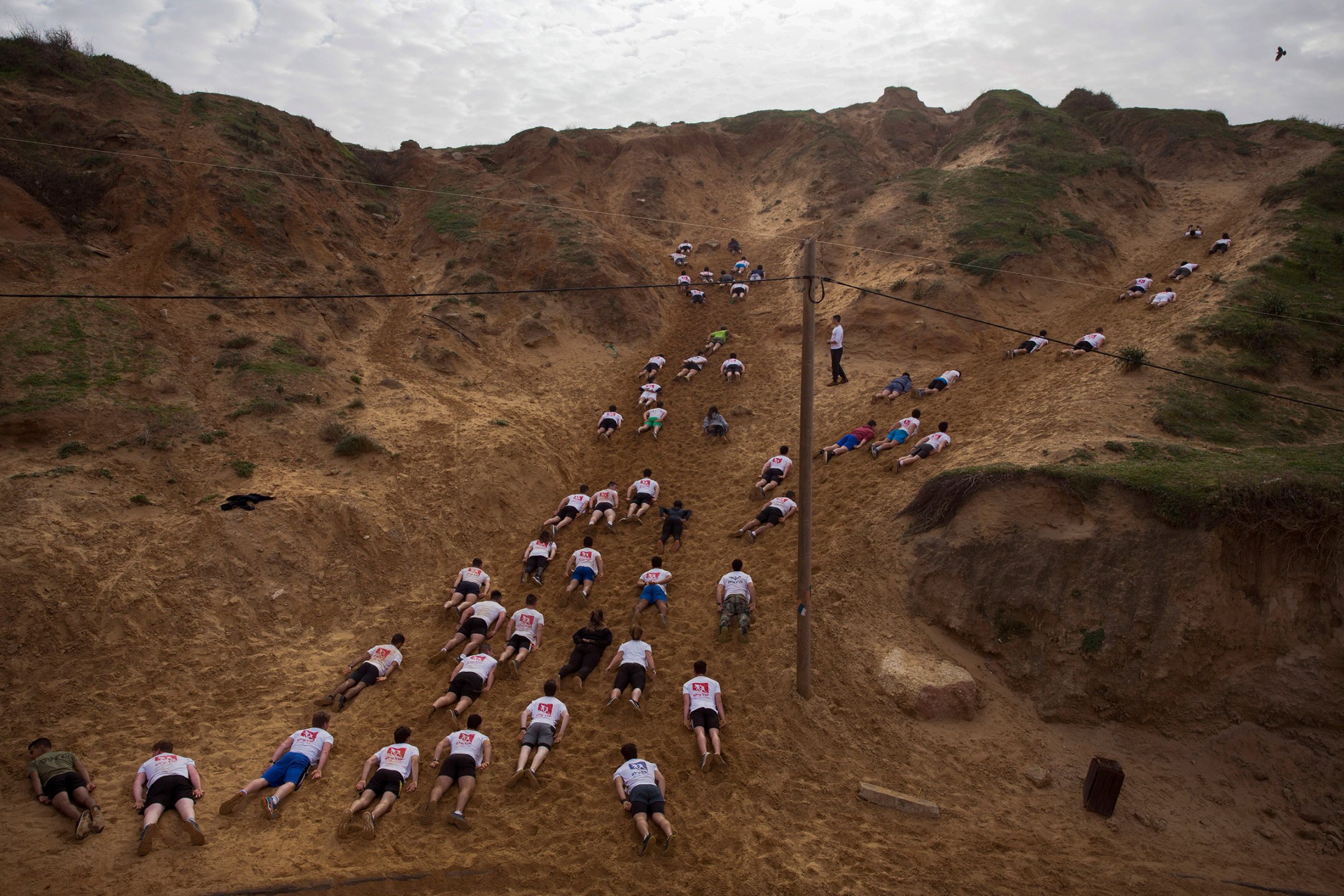
There's a difference between the ground the people are laying in and the nearby earth, and that creates a sort of path that these people seem to be traveling on. I feel that if I was there in real time, they would be sliding along like as if the ground was a conveyer belt.

I really like the bright lines this creates. It almost doesn't seem real, but it is.
1.

I literally don't know any other 2019 songs. I am less knowledgeable than a box of rocks when it comes to popular music. I just happened to know Old Town Road because everyone kept singing it when it was popular.
2.

I really enjoyed Avengers Endgame. It was Marvel's biggest movie ever, and being 3 hours long, it was intense, action packed, and just a great movie in general. I brought everything Marvel had been working towards to an end in such a dynamic, grand way. Also, I like disposable CGI armies.
3.
/cdn.vox-cdn.com/uploads/chorus_image/image/65287206/1169824973.jpg.0.jpg)
The area 51 raid meme was a very large event. A single person made a joke about it, and hundreds of thousands of people accepted the invitation to raid the base. The "raid" itself just turned into a sort of extraterrestrial themed festival near area 51. I hope September 20 becomes a holiday.
4.

Donald Trump is the president, and he runs the country. I can't think of anyone more important the our country's leader.
5.

A lot happened for Pewdiepie in 2019. He earned millions of subscribers early in the year, he reached 100 million subscribers on Youtube, he finally got married, and he made Minecraft popular again. He's a very popular Youtuber.
1. My grandpa got stage 4 brain cancer.
2. I want to drive and get a job.
3. I can't wait for summer.
Subscribe to:
Posts (Atom)